


Allternativa
PT
Allternativa é uma loja de roupas criada por duas amigas que enxergaram a dificuldade que jovens da nova geração encontram ao querer combinar peças e optaram por desenvolver roupas que valem pra toda ocasião. Um top, por exemplo, que antes ia só pra academia, agora também vale pra faculdade, pra um bar com amigos e até mesmo pra uma festa. O propósito aqui é sempre ser uma alternativa.
A partir do ponto de partida da marca, o desafio surgiu em como apresentar a versatilidade abraçada em um conjunto gráfico que fosse expressivo e, ao mesmo tempo, se mostrasse como algo contemporâneo para o público-alvo. Além disso, outra premissa importante era ressaltar o caráter orgânico da identidade, não só pela arquitetura visualizada para loja, como também por conta do processo criativo das idealizadoras do projeto.
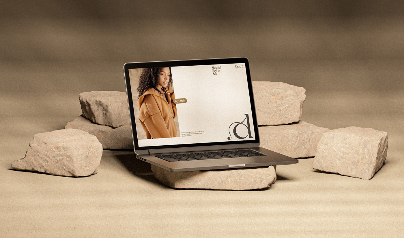
Assim, estilizamos a tipografia do logotipo e desenvolvemos um “A” como símbolo, explorando sempre uma sinuosidade que também é desdobrada para todos os grafismos. Esses, absorvem diferentes texturas do universo da marca e trazem linhas percorrendo sentidos livres. Por fim, estipulamos também uma paleta de cores neutra, porém vasta, capaz de caminhar com a marca em diferentes territórios e oferencendo um caráter mais flexível à toda identidade visual.
EN
Allternativa is a clothing store founded by two friends who noticed the issue young people of this new generation face when trying to mix and match pieces, so they set their goal: make clothes that work for every occasion. A top, for instance, that might be only used for the gym, now is also perfect for college, a night out at a bar with friends, and even for a party. The purpose here is to make every piece match the brand’s name, which in Portuguese translates to “an option”.
Starting from the brand's standpoint, the challenge emerged in how to present versatility in a graphic system that would be expressive yet contemporary for the target audience. Furthermore, another important premise was to emphasize the manual and organic aspect of the identity, not only because of the visual architecture of the store but also due to the creative process of the project's founders.
Thus, we stylized the typography of the logo and developed an "A" as a symbol, always exploring a sinuosity that is also unfolded across all the graphics. These absorb different textures from the brand's universe and bring lines going free directions. Finally, we also established a neutral yet extensive color palette, allowing the brand to explore different kinds of layouts and, therefore, getting more versatility to the whole visual identity.


SARAU TEAM
Creative Direction: Pedro Almeida, Matheus Abitbol
Design and 3D: Matheus Abitbol
Production: Gabriel Amaral, Luiza Lootens
Production: Gabriel Amaral, Luiza Lootens
MOTION DESIGN
Gabriel Castilho
ALLTERNATIVA TEAM
Ana Elisa Ribeiro, Tassiane Araújo
TYPOGRAPHY
Voyage (VJ Type)
Perfectly Nineties (Jen Wagner Co.)
Plus Jakarta Sans (Tokotype)


